
.jpg)
 1 day ago
12
PROTECT YOUR DNA WITH QUANTUM TECHNOLOGY
Orgo-Life the new way to the future Advertising by Adpathwayby Justin Bell
Welcome back to Illustrator Avenue! In this edition, I spoke with Villő Farkas, the Art Director, Graphic Designer and Project Manager at Mindclash Games, the publisher of both casual and serious Eurogame titles such as Anachrony, Emberheart (via the more casual Mindclash Play line) and Voidfall.Villő and I first met a couple years ago, and I’ve had the chance to spend time with Villő and the rest of the Mindclash team during a visit to their offices in Budapest last year.
Enjoy! And if you like this series and/or are an illustrator or graphic designer, please reach out. I’d love to chat about future features in this series.

Justin Bell (JB): Villő! It’s always a pleasure. I’ve gotten to know you a little bit over the last few years but for the benefit of our audience, let’s learn more about you. When did you join Mindclash, and what were you doing before you joined the team there?
Villő Farkas (VF): 38 years ago...just kidding. In a nutshell, I have loved drawing since I was a child, as most of us did at that age :) but I continued diligently and during my high school years it became clear that I wanted to pursue further studies in the field of the arts. It's worth noting that, back then, I never would have imagined that I would one day become a board game artist. :) I graduated from Applied Arts Institute as a graphic designer in Sopron (Hungary) in 2012. During my final year of college, I interned at an advertising agency called Café Design (a division of Café Communications in Budapest), and I continued working there. I learned a great deal here about graphic design for advertising and useful tips for using Adobe programs, which is why I always look back fondly on my first job and the mentors I worked with. They were the ones who encouraged me to start working in digital illustration, and they were the ones who gave me my first Wacom tablet too (digital drawing tablet). I have gone through quite a few of them since then.
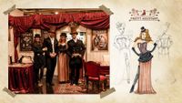
I joined Mindclash Games more than 12 years ago, no this is not true. :) I was already there back then when we became a publisher. One fine day around spring 2014, together with our former co-owner, Richard Ámann and our current CEO, Viktor Peter, we decided to quit our jobs (I know Ricsi from Café Communications) and devoted a year to developing and designing our first board game. In the fall of that year, I visited SPIEL Essen for the first time in my life. (Europe’s largest board game expo is held there every year). Yes, we went there by car approximately 1100 km and yes we brought all our equipment and our good spirits. The entire event and the industry as a whole made a deep impression on us, and we made an impression on them as well. (See the photo below of our first booth.) I remember that even Tom Vasel stopped by to check out what this game was all about. After that experience, it became clear that this was what we wanted to focus on in the future. Following our successful Kickstarter campaign in January 2015 for the game Trickerion: Legends of Illusion, we had no doubts left: we wanted to start our own publishing company - and the rest is history.
JB: I first fell in love with your work, like many players, with Trickerion. The worldbuilding is part of why Mindclash has so many fans today, but it all began with Trickerion. What are some of your earliest memories about helping to create things like the board, the portraits of each magician, and the challenges of that first project?
VF: I know this interview is supposed to be about me, but I don't want to take credit away from anyone else - we really did create the world of Trickerion together with Ricsi and several other illustrators (Gergő Ádám, Csilla Biró, László Fejes, Márton Gyula Kiss, Attila Sáfrány, Ágnes Staudt), and the truth is, I’m at my best when I’m working as part of a team; I couldn’t be further from the lone-wolf artist archetype.
So how did I feel when I started working on Trickerion? I immediately realized I was taking on a rather ambitious project, but at the same time, it was incredibly exciting, and I wasn't alone. Perhaps other board game artists would agree that designing an entire board game - everything that fits in the box and the box itself - is an extremely complex graphic and artistic undertaking. Every element of the game is interconnected, and if I do my job well, I feel like a conductor who maintains harmony among all the game components and provides the audience with a lasting gaming experience - and that’s why I’ve always loved working on board games, especially in my role as an art director. Back then, we were perhaps among the first development teams (we weren't a publisher yet) dedicated to creating the rich worlds of Euro-style board games - and that has remained our trademark ever since. I can’t even imagine it being any other way. :)
How does it work? In our design process, world-building has been closely intertwined with the core of the game mechanics from the very beginning. In fact, the theme itself inspired this game; all three of us were deeply influenced by Christopher Nolan’s film The Prestige. And the guys started building the entire game mechanism around the theme of stage magic. (If you are interested in the whole game design process, you can read about it here). Then, at some point in the process, the third area - graphic design - comes into play. Yes, I know, we'll get to illustrations soon, too. For example: How big can the cards be? What components need to fit on them? Do cards need to fit on the main board? How can we help players remember the rules when they sit around the table? And many other important questions. I usually design user interfaces, game branding and icons at the same time, and I really enjoy using the icons to develop the game's unique language, but Ian O'Toole remains the uncrowned king of this genre. I typically say that if I can't express a certain “action” using our icon system, then perhaps that “action” still needs to be developed - much to the delight of our game designers. These three fields (world building, game design, graphic design) influence one another, shaping the game’s final form and its individual elements.
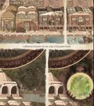
We've finally gotten to the illustration of the main board. This is the part of the game where I can best show the fantasy world we’ve built: The tale of Dahlgaard the Magnificent is entwined with Magoria, a sleepy town at the dawn of the Industrial Revolution. I wanted players to feel, while playing, as if they’d been transported to a bustling city, and the user interface is an integral part of the overall design. I collected a lot of old photos of Victorian-era buildings for inspiration to draw the city, as well as photos of strange early 20th-century machines, which I also used to design the cityscape. So, when you place your worker (I have forgotten to mention but this is a worker placement game :)) to the “Downtown” space, you’re actually stepping there in the game world. That’s why I didn’t choose the usual bird’s-eye or isometric view for the cityscape, but rather a one-point perspective where you can see the details of the building façades and the people in the city.
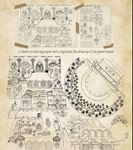
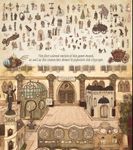
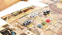
Even on the illustration created for the first edition, there are countless tiny details to discover while playing; in fact, if you look at both sides of the board, you can see the town is a little bit different - for example the renovation of “The Magnus Pantheon” is being completed and “Dark Alley” location is available with the fortune teller, and with her new mechanics were added to the base game.
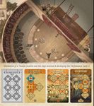
The biggest challenge was representing three theaters in the middle of town with just one enlarged Theater location on the board. The user interface also had to show which magician would headline at each theater and when, how magicians could appear in one another’s performances, and how everything would be scored. As I explain it now, the memories come flooding back. Whatever solution we considered, players still needed to use a little imagination and accept some abstraction.
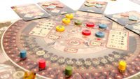
As a first step, I tried to set this location slightly apart from the rest of the game board, so I changed the viewpoint to make it seem as if we were a spider sitting on the ceiling, watching what’s happening behind the scenes of a performance. We can see the audience, which also serves as a scoring scale, while a performance is currently taking place on stage; meanwhile, the crew (specialists) is working behind the scenes. Using the user interface, you can find out which magician is performing on which day over the weekend, and the various performance cards (not part of the main board) show you the actual theater along with the show’s schedule, where you can perform alongside others as the lead magician. If you’ve played the game before, you know the rules are more complicated than that, but I won’t go into any more detail here.
To be honest, my career in character design came to a complete halt after Trickerion. I really enjoyed this aspect of illustration as well, but I focused more on developing other aspects of my skills. The reason I’m still attached to the character illustrations from the first edition is that I had the opportunity to sneak us - the creators - and those close to us into this world. I have to admit that I use photographs as a basis for character design, but not just any photos - we held special photo shoots to capture the best poses and take pictures of anything that even remotely resembled the outfits we’d envisioned.
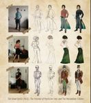
And finally I’d like to share an interesting detail about character design. In this fantasy world we’ve created, we set the rules - and while many things in the game don’t correspond to reality, the characters do. Even in the early 20th century, there were already female magicians and magicians from other ethnic groups. Now you’re probably wondering how I know about people from the Yoruba tribe. Through my dear friend Emőke, who served as the model for none other than the fortune-teller character. Regardless, the effort to ensure that everyone is represented has remained an important mission of ours ever since.
JB: It was fun to visit the Mindclash office to see what kinds of games all of you play during breaks in the work day. Outside of work, what types of games do you like to play? Maybe more importantly, how often do you find the time to play games? What do your playgroups look like? And what is your all-time favorite title?
VF: I have to admit that in real life, I’m not much of a board game player. I usually play with coworkers - Robin and Soma Gál always manage to find a game I’m happy to sit down and play. I love designing mind-bending strategy games, but I only like to play ones that are visually appealing, where world-building plays a major role, and where there’s someone to explain the rules. Usually, one of those three conditions isn’t met. Mindclash has ruined my taste forever. That’s why I prefer games like Harmonies, Azul and Hitster - my own group of friends tends to be more casual gamers, too.
JB: Who are some of your favorite tabletop artists? How about your favorite graphic design and UI work in the industry? I love learning more about what work other artists admire from afar.
VF: It’s not hard to guess that I’m a fan of Ian’s work; I look up to him for his expertise in both illustration and graphic design, but I don’t want to write about famous board game artists right now. I’d like to highlight that here at Mindclash Games, we have two amazing graphic designers, Atesz Kerek and Albert Bochnert, without whom we wouldn’t have so many beautiful games. I know that most of the time, it’s the illustrators who get the recognition, or artists who excel in multiple fields. But a beautiful illustration is worth nothing if the rest of the game’s graphics aren’t well-designed. When a board game’s graphic design works well, the UI almost disappears into the experience while making the game easier to play.

JB: Let’s talk about a new project that you recently finished. With the release of Courtroom: The Noir Trilogy, I’m still quite surprised that Mindclash released a game based on a real-life period and not another fantasy world like the ones your teams created for projects like Cerebria: The Inside World and Ironwood. How much of the final game’s art is yours? What kinds of items are illustrated here? I’m curious about the scope of the work you completed for this project, and how long it took to finalize.
Walk us through some of the images from Courtroom, especially if there are a few that you are particularly proud of. How did this go from concept to what it looks like in the game’s final production?
VF: I’d like to put this game into context. A few years ago, we launched a sub-brand called Mindclash Play, which brings smart but less complex games to the retail market, and Courtroom is our fourth game. World-building plays a key role here as well, along with the visuals, but we’d like to reach new audiences with these games. Courtroom is a competitive, team-based investigation game where the case has no predetermined solution. Players pick a side - Defense or Prosecution - look for clues that support their side of the story, build a stronger case than the opposing team, and aim for victory!
Although I really love creating fictional worlds, it was a great experience to work within the framework of a specific historical period - though it was also more challenging. Robin Hegedűs and Tünde Máté, the two designers, put a tremendous amount of research into ensuring that the details of the stories were completely accurate. In a fictional world, any rule is possible, and with this type of game, it’s important to think in terms of that specific era. That was one of the reasons we chose a real historical era, but we made sure to list fictional companies and change the addresses of the official agencies.
I don’t consider any of our games to be entirely my own creation, and Courtroom is no exception. It’s the result of four people working together. Tünde and Robin shared what they had found in their research, and the three of us discussed it at length. I then looked further into the details of everyday life in that era.
What everyday items were in style back then, and what kinds of cars did people drive? Was the 911 emergency number in use in New York in 1936? I’ll let you in on a secret: not yet. In the meantime Barbara Bernát, our character illustrator, worked with Robin to research the clothing and hairstyles of the era, and she drew the witnesses based on that research. I took it a step further. I researched what fonts were in use at the time, what newspaper front pages, receipts, business cards, movie posters, official documents, and black-and-white crime scene photos looked like. And based on the information I gathered, I designed every single detail of the evidence cards. Although Art Deco was the popular style of the era, I used it mainly in the box design and not so prominently on the components. While I personally adore film noir aesthetics, we restricted that specific visual flair strictly to the black-and-white photography elements. I wanted players to feel as if they were stepping into a time capsule when they opened the case envelope. It would be nice to see them all at once, wouldn’t it? I’m very sorry, but I can only show a few details without spoiling the rest of the gaming experience.

I worked on this project from August of last year through May of this year. There were some intense periods, but I think my craziest idea was the following: In one case, the suspect was a female painter, and I didn’t want to use an actual painting, so I spent 2 weekends stepping into the character’s shoes and created three surrealist images digitally. Robin liked them so much that he thought it wasn't enough for them to just appear on an Evidence card, so he came up with a separate mini-game called *The Postcard Mystery*.
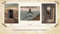
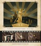
Unusually for me, the first step in the design process wasn’t the graphic design and illustration of the components - I always start with that and leave the box cover design for last. Yes, I know, most board game artists do it the other way around. So now I tried this path. I’m not giving away any big secrets, but this game should be viewed as part of a series, and the challenge was figuring out how to create a box cover design that would work with and tie together every member of the series, while still distinguishing them from one another. My solution was to use the statue of Justice as the central element, which is the same on all three covers, while the background illustration and logo are designed in a style appropriate to the respective era.
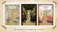
As I began working on the sketch and continued painting the background illustration, I was even able to sneak in the iconic silhouettes of one or two skyscrapers from that era into the overall composition. One of my favorite discoveries during my research was that in 1936, they were still using the longer “Hollywoodland” sign. My latest project is always the one closest to my heart, but I really poured all my knowledge and love into this one.

JB: One other question for you, since you have the same gaming headset that I have at home: are you also a regular video game player? What are some of your favorites?
VF: You're right - those are gaming headphones. I bought them so that when I had free time, I could play Horizon Zero Dawn on my PS4, but this year I've always ended up doing something else or just relaxing. Still, maybe it's time for me to return to that universe.

A big thanks to Villő for spending some time answering my questions for this interview. Also, a big thanks to the Mindclash team for sharing some of the incredible imagery from their past and future catalog. You can check out the complete Mindclash catalog at https://mindclashgames.com/.
Are you an illustrator and/or graphic designer involved in the creation of images and iconography for the tabletop space? Please reach out! I’m building up a repository of people interested in contributing to this series. Just message me here on BGG and we’ll get to work. Thanks for reading!






 English (US) ·